Categories
Archive
Recently Added
HABITAT by Evergreen Construction, Your Holistic Paradise
SOUNDS OF THE SEA, SPIRIT OF THE MEDITERRANEAN
FROM VISION TO REALITY
North Steel Homes - Where Luxury Meets Sustainability
Aspen Mountain SPA - A Rare Standard, Timeless Investment
Latomia 1933 - A Cultural Jewel Reborn In The Heart Of Kyrenia
Professionalism with Purpose: Where Transparency Builds Lasting Trust
Create Your Own Story With Ciddi Home
BELLA One Estate: The Address of Trust and Quality in the Real Estate Sector
Özyalçın Construction: Reinvent the Mediterranean
Tags
Interior Design / Architecture
Interior Design Tips for Small City Apartment
written by Interior Designer Nermin Gündoğdu
Continuous forms, reflected spaces, dark colour palette
For *Two.
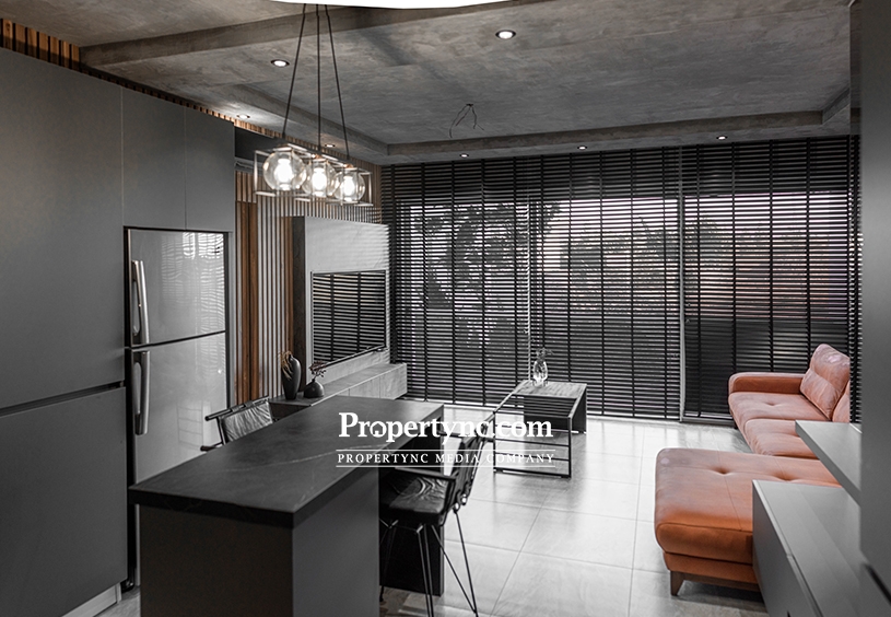
A small city apartment embraced with dark colours.
As new-build apartments become more small and expensive than ever, designers and users are both on a mission to come up with ideas that are multifunctional, space saving and affordable.
Here is the good news: It is possible to achieve a spacious, bright and stylish apartment within a small square meter area - even with a dark design palette.
The challenge in the design of the Small City Apartment arises from its distinctive language on spaces. We avoided clutter, contrasting colours and dramatic separations; used continuous forms, reflective surfaces and vertical forms in order to give the illusion of a large space with a tall ceiling.
We achieved our goal; created one language between different functional areas through a common material palette. Now, we have an open-plan living without physical and visual boundaries. All areas are joined naturally by the same materials and flowing with a harmonious continuity.
Custom carpentry was necessary in order to achieve our goal of creating a unique, private interior. All furniture pieces are tailor-made to bespoke dimensions. Most of the budget was spent on custom wood-crafted pieces, built from scratch to avoid pre-made factory units.
Looking to own a studio or one-bedroom apartment! You can view the latest apartments listings on our website from this link ;)
By all means, the leading feature of the design is wooden wall panels. This is an intentional decision to give an embracing feeling along the longest part of the house. It highlights the depth of the space and connects the living room, kitchen and entrance. After highlighting the depth of the volume, boundaries between wall, ceiling and the floor are blurred through extensive use of grey/concrete surfaces in order to strengthen the continuity in the design.
Repeated grey background makes us perceive the interior space as a single whole and creates the impression of spaciousness. In the beginning, the owners hesitated, thought it was a bold statement, and needed to be encouraged. But whether you have a small space or a large place, painting all surfaces creates a feeling of a larger room. This is the method that I use again and again to manipulate standard ceilings with boxy interiors into luxurious environments.
Bonus information, we have a huge window in the living room! We have plenty of light, which strengthened our decision on a dark colour palette. So, If you plan on going dark colours, just make sure your room gets a sufficient amount of natural light so it doesn’t feel too depressing.
On the other hand, reflective surfaces will help you to maximize the light in a dark interior and help you to create a sense of illusion while bringing an aesthetic value to your interior. The mirrored walls both visually enlarge the space and also create a dramatic geometry.
I used two reflective walls in the Small City Apartment. They are both great helpers for bouncing natural light into the interior but they also have individual roles. The larger one is used to create a symmetrical reflection of the kitchen and living room. The other one is kept deliberately narrow to give a feeling that there is another room behind the walls.
If you have been struggling with making your small space feel spacious, I encourage you to use fixed furniture design solutions and large pieces in addition to the methods I mentioned above. It seems counterintuitive, but small furnishings can actually make a room look smaller. Use vertical line detailings, make use of floating one size fixed - large furniture pieces. Floating pieces and large scale furniture will help you to avoid clutter in your apartment, which is critical in small spaces.
So there you have it!
Continuous forms and repeated colours are my essentials; reflective surfaces and light plays are my methods for major aesthetic appeal in small spaces. Small City Apartment is a great example to showcase the creation of a spacious environment that feels much grander than it actually is.
If you try these tricks, let me know how it goes. :)
Looking for your next home to decorate! Propertync portal offers a wide range of apartments and villas for sale. you don't want to miss out on some of the latest real estate projects and special offers.
Instagram | @solid_house | @nermingundogdu
written by Propertync Media
date : 05/10/2024 hour : 02:08 PM


